Size Does Matter Part 2: How to resize an image

As mentioned in Part 1, potential clients and Google expect your website to load quickly. Put simply, faster websites perform better.
Connection speeds have improved significantly in recent years and as a result, website performance is now essential for SEO, as is user experience.
Think about your own experiences using other companies’ websites. Do you wait patiently for a page to load, or do you lose interest and leave?
If it takes too long for your page to load, your visitors may do just that, lose interest and leave. Worse still, they may go to your competitors’ websites.
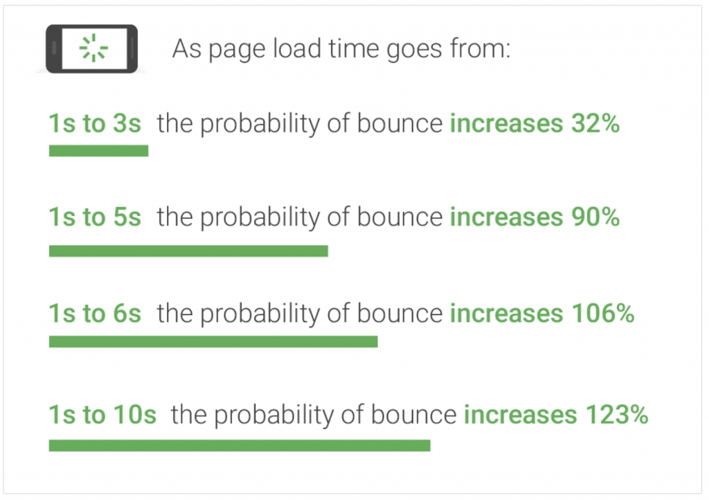
A bounce rate is the percentage of people who visit your website and then leave rather than viewing any other pages – so they just visit that page and then leave. See the bounce rate statistics from Google below:

It is likely that half of your visitors are using mobile devices, so delivering optimal image file formats and sizes is critical. Again, if your website isn’t mobile friendly, your hard-earned traffic decreases and your Google rankings will follow.
To optimise website performance, file sizes need to be decreased, but quality needs to be maintained. Smaller files ensure the pages load faster and significantly improve SEO and user experience. The better the experience, the longer they will stay.
Why should you resize and compress your photos before uploading them to your site?
There are many reasons to resize your images before uploading them including:
- Enhanced website performance and customer experience;
- Faster, and possibly cheaper, backup storage;
- Improved SEO; and
- A higher conversion rate due to improved experience.
What are the best image sizes for websites?
On this occasion, the “image size” we are referring to image pixel dimensions (width and height in pixels).
First, you need to find out what are the best image dimensions you need for your pages. This will help you prepare them better on your computer.
If you upload images directly to your site without considering the actual size they are being used at, you will cause big performance issues.
Regardless of file formats (JPG, PNG etc.), you should never upload high-resolution images to your site because larger images take much longer to upload.
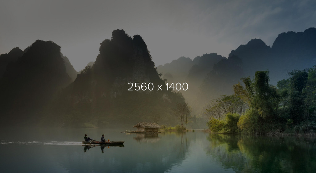
For full-width sliders (that automatically stretch to the full size of the browser), we recommend 2560 pixels in width. This is the standard resolution width for 27″ and 30″ monitors. The height is determined by the image proportion. For example, a short image might be 2560 pixels x 400px or the image might be taller and be 2560 pixels x 1400 pixels. It all depends on the banner size. See examples below:


From this, it’s easy to determine the sizes you need your images to be for other areas of your website. For example, if you have an image that covers half of the screen, the width of that should be 2560 / 2 = 1280 pixels.
You can then use this theory throughout the rest of your website:
1/2 = 1280 pixels
1/3 = 853.333333 pixels (round to 850 pixels to make it easy)
1/4 = 640 pixels
1/5 = 512 pixels (again round to 510 if you want)
You get the picture.
Minimising the dimensions will also help with the file size which we focused on in Part-1.
How to edit the dimensions of your images.
If you have design software such as the Adobe Photo Suite, you can easily edit the dimensions of your image.
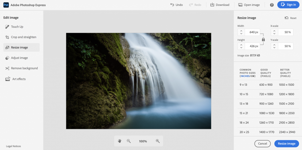
For those of you who don’t, there are lots of online tools you can use to edit image dimensions but make sure you select “keep aspect ratio”. This means the proportion will stay the same and it won’t squash or cut your image.
One free tool we have used is Adobe’s free online photo editor – when you upload an image, you can select to cut it down to the correct dimensions. I have edited the image below so the dimensions would fit 1/4 = 640 pixels. The link is: https://www.adobe.com/express/feature/image/editor

This is a fantastic little tool and is free with no need to sign up! #winning.
Still need help?
If you don’t feel confident, or have the time to optimise the images for your website, get in touch and we will improve your website performance for you. Call 01772 393080 or email info@pagio.co.uk.
Need a professional website that is easy to manage?
Sign up or book a free 30 minute website consultation with one of our team who can demo Pagio Website Builder and answer any questions you have.
